The New, Classic Melody49.
Drive-in movie theaters are closing one after another: only 300 remain in the United States. The digital and streaming world made drive-ins irrelevant because consumers are only one click away from their favorite movie while in the convenience of their home.
Melody49 is a 1960’s drive-in movie theater located on State Route 49 in Ohio. The purpose of this brand is to allow families to have an unique, outdoor experience with other methods of entertainment other than the indoor theaters and streaming from home.
How can Melody49, a drive-in located in Ohio, become relevant in a modern-day world?
Project Outline
THE PROBLEM
Melody49 needs to think about how a consumer is experiencing their product. The drive-in needs to improve on their screen technology, food choices, comfort, movie watching, and offer an unique family adventure.
TARGET AUDIENCE
Melody49 consumers are families and couples of small towns who value personal relationships. These people are loyal, dependable, yet want a fun experience to remember. Age ranges could vary, dependent on family.
PROJECT GOALS
The goal of this project was to revitalize Melody49’s dying brand into an entertainment center to offer a different and memorable theater experience to their consumers. This project was not only to design a brand, but to elevate their services and expand their product line.
Brainstorm
PURPOSE AND BRANDING MESSAGE
Melody49’s purpose is to strengthen bonds and community ties by offering unique and modern experiences that test the limits of a regular movie theater.
The branding message is: Melody49 puts the regular movie theater to the test by offering other exciting and different experiences like an entertainment center. Examples of services include camping, swimming, sixth sense vibrations through the ground, and a homegrown food service (similar to Sonic and/or A&W) that will keep customers coming back for more.
BRAND ARCHETYPE
Melody49’s archetype is The Explorer. Consumers go to Melody49 to be adventurous, outgoing, and have inclusive and new experiences.
SWOT Analysis
For this section, a SWOT (strengths, weaknesses, opportunities, and threats) analysis will be used to analyze the new design for Melody49.
STRENGTHS
Unique services offer a strong and more exciting experience for those who would like to spend time with friends, family, etc., through modern day technology. Melody49’s highway location gives more marketing opportunities.
WEAKNESSES
Updates are expensive due to advanced technology, camp ground expansion, and food service. Melody49 must have a high number of customers per summer night. Another weakness includes only opening during the summer.
OPPORTUNITIES
Melody49 can include experiences similar to fairs or amusement parks. More opportunities could be rotating events, like swim night or camp-out night to heighten the experience and specifically segment the target audiences.
THREATS
Examples include the natural elements; competitors, like summer events like fair or amusement parks; and digital streaming at home.
The Design Process
LOGO SKETCHES
Melody49’s new logo design is based on the project outline and brainstorming process. The original inspiration for these sketches was Las Vegas signage. The bold neon colors and heavy weight font express exploration, inclusiveness, and excitement
FINAL LOGO
Melody49 is a drive-in movie theater, but they offer other outdoor experiences to push fun, adventure, and exploration for all families with ‘retro’ style. The main logo mark illustrates fun and exploration by its bold, yet rounded sans serif font. The full color mark is to be used for documents, the website, and ads that utilize white space.
COLOR PALETTE
These five branding colors express the retro, fun, and adventurous entertainment options that Melody49 has to offer. Simplify: These colors refer to the neon lights of the '80s. This color palette welcomes new and old generations and can be used to organize certain design elements within the brand.
ICONOGRAPHY
These icons are derivative of the logo and have a spunky, retro attitude that Melody49 lives by. Some icons can be used for wayfinding, merchandise, buttons for the website and can be featured within the app. All icon designs are cohesive, consistent, and can be color-coded for whatever media.
TEXTURES
These fun, creative, and colorful patterns are retro but relevant with their thick line and shape work. These textures will be used on the web, print media, and merchandise; however, they will not be featured as an overlay on Instagram or candid photography.
Deliverables
These deliverables utilize brand assets and colors in a strategic and appealing manner that attracts the audience. The items read from left to right: MY49 Eats packaging, MY49 map of offered experiences, MY49 tent, MY49 airpods, MY49 lawn chair, and MY49 collectable waitress skates.


Marketing Campaign
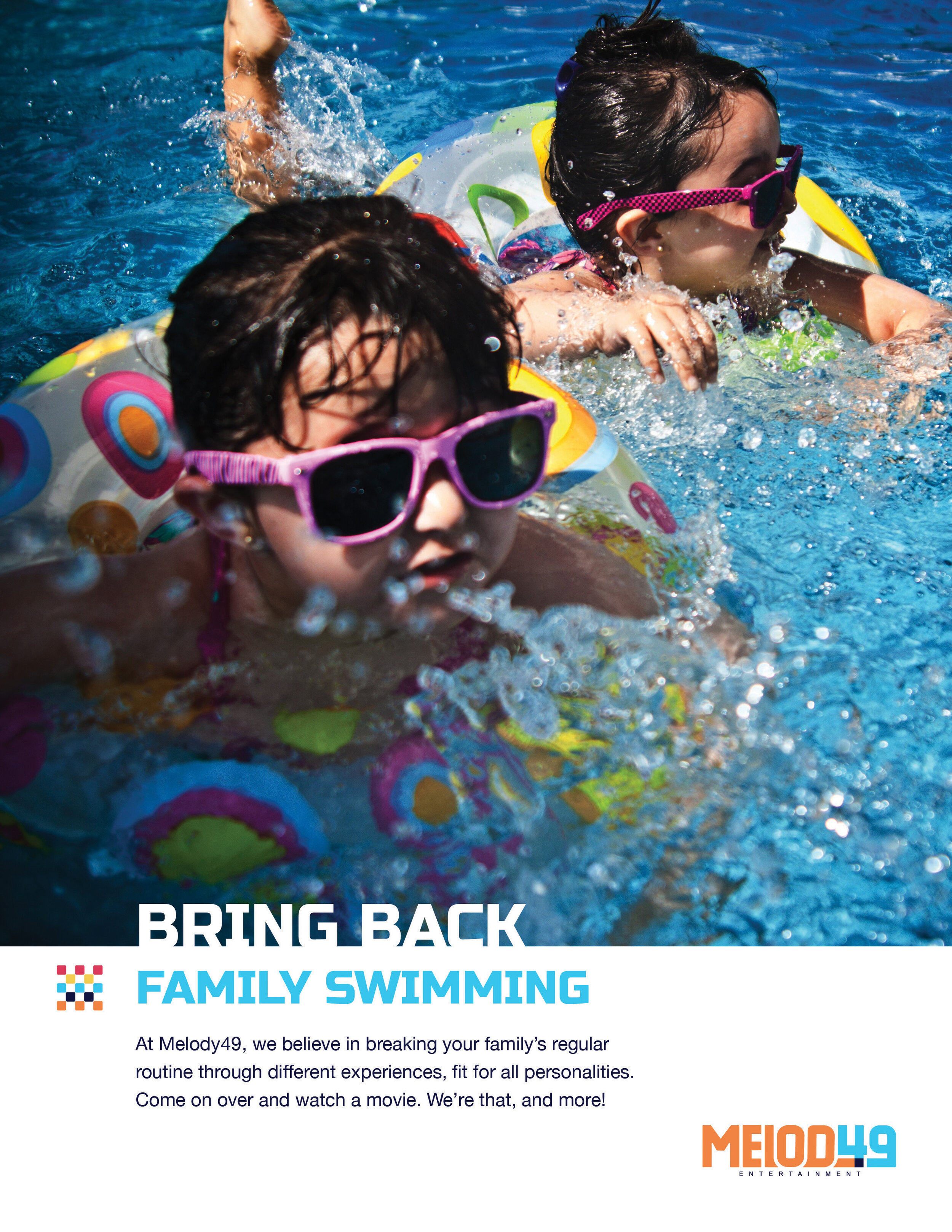
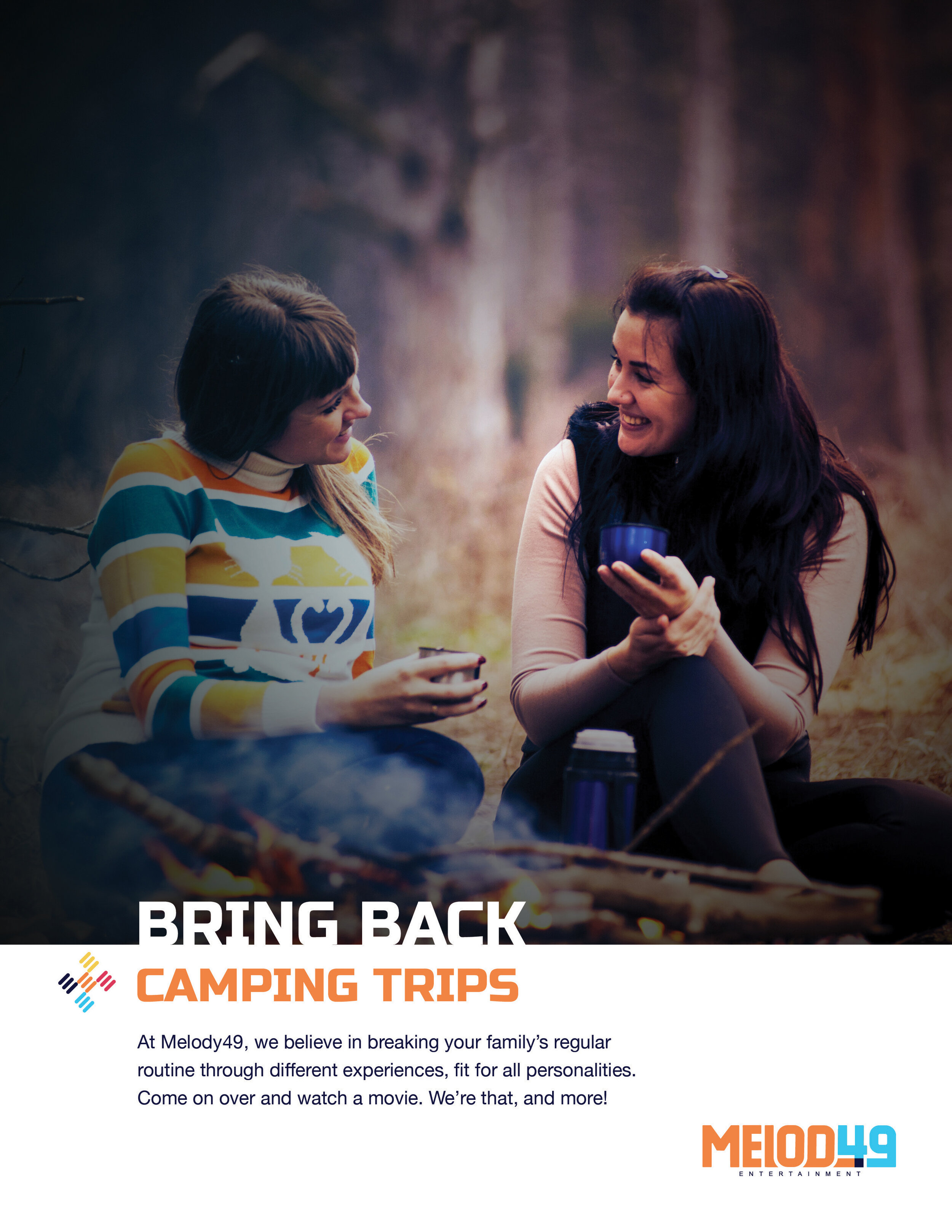
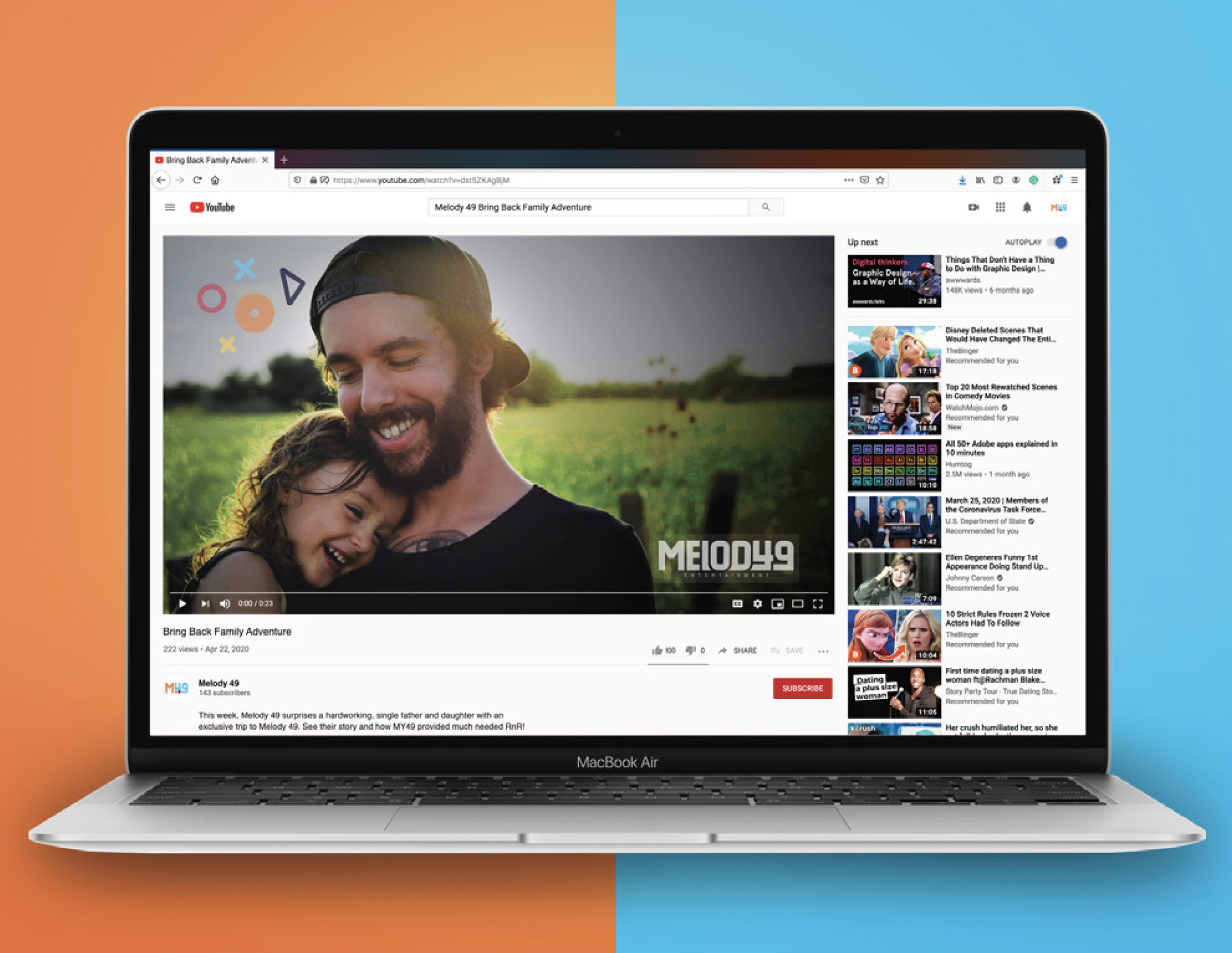
These ads encourage family time through activities that are rarely implemented due to busy lifestyles. This campaign features printed flyers in local businesses and billboards located on State Routes 49 and 127 and interstates 70, 75, and 35. A social act video will enforce this campaign, which offers a single, hardworking dad and his daughter a free trip to Melody49. Viewers are able to see their story and how MY49 reunites them.


Want to See More?
Read more about this brand strategy and design within the Melody49 brand guidelines.


